
CLEAR MARGIN PUBLISHING HOUSE
OVERVIEW
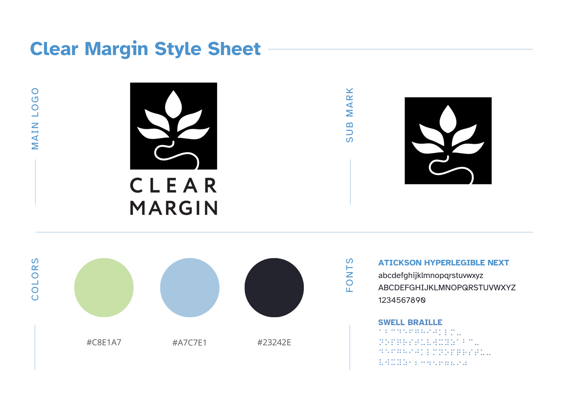
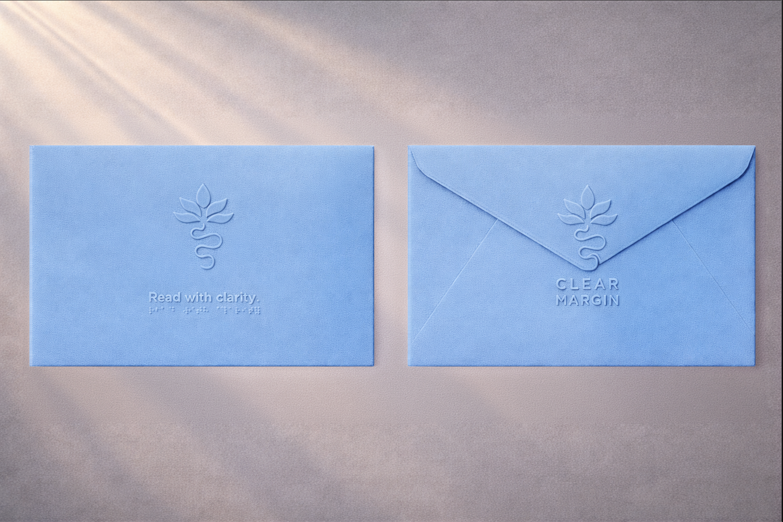
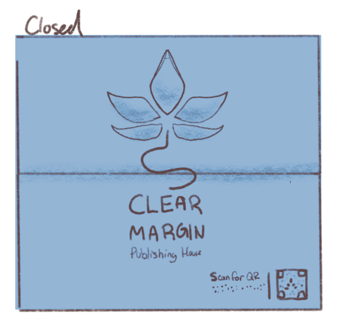
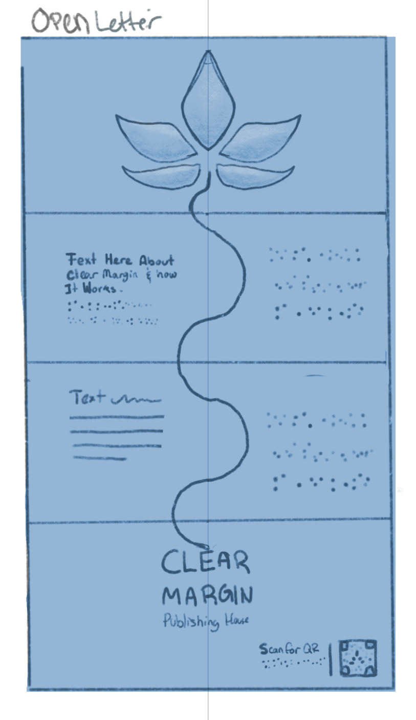
Clear Margin is a brand identity project focused on designing for those with low or no vision. The system uses a minimal palette, tactile materials, and subtle embossing that serve to bridge the gap between traditional publishing and accessibility.
Project Components
Branding Design
Book Cover Design
Product Design
Mockup Creation via AI (Sora, Midjourney)

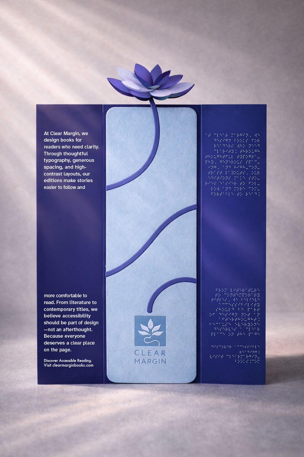

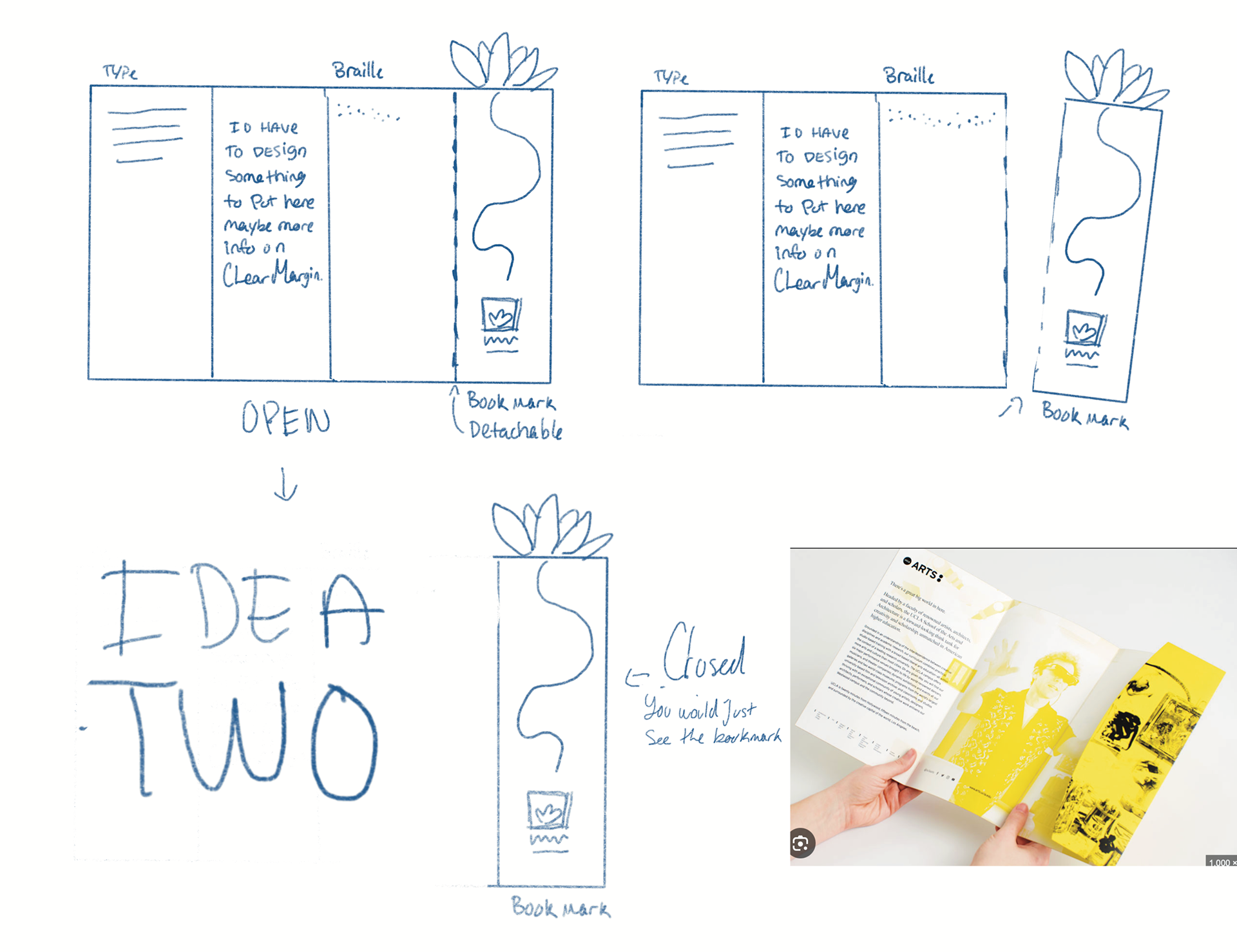
The trifold can be seperated and the middle becomes a bookmark.
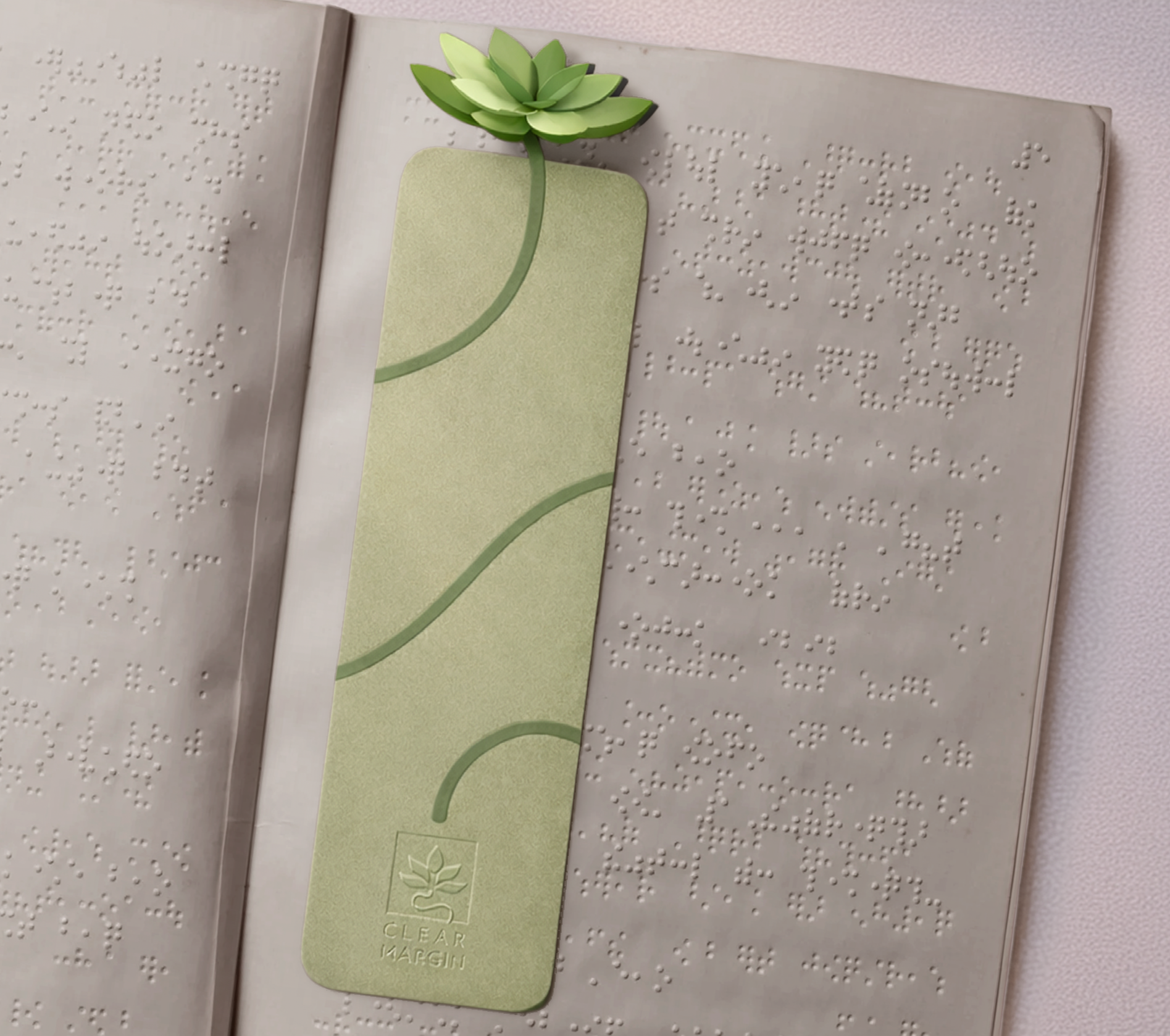

Bookmark when enclosed within a book.

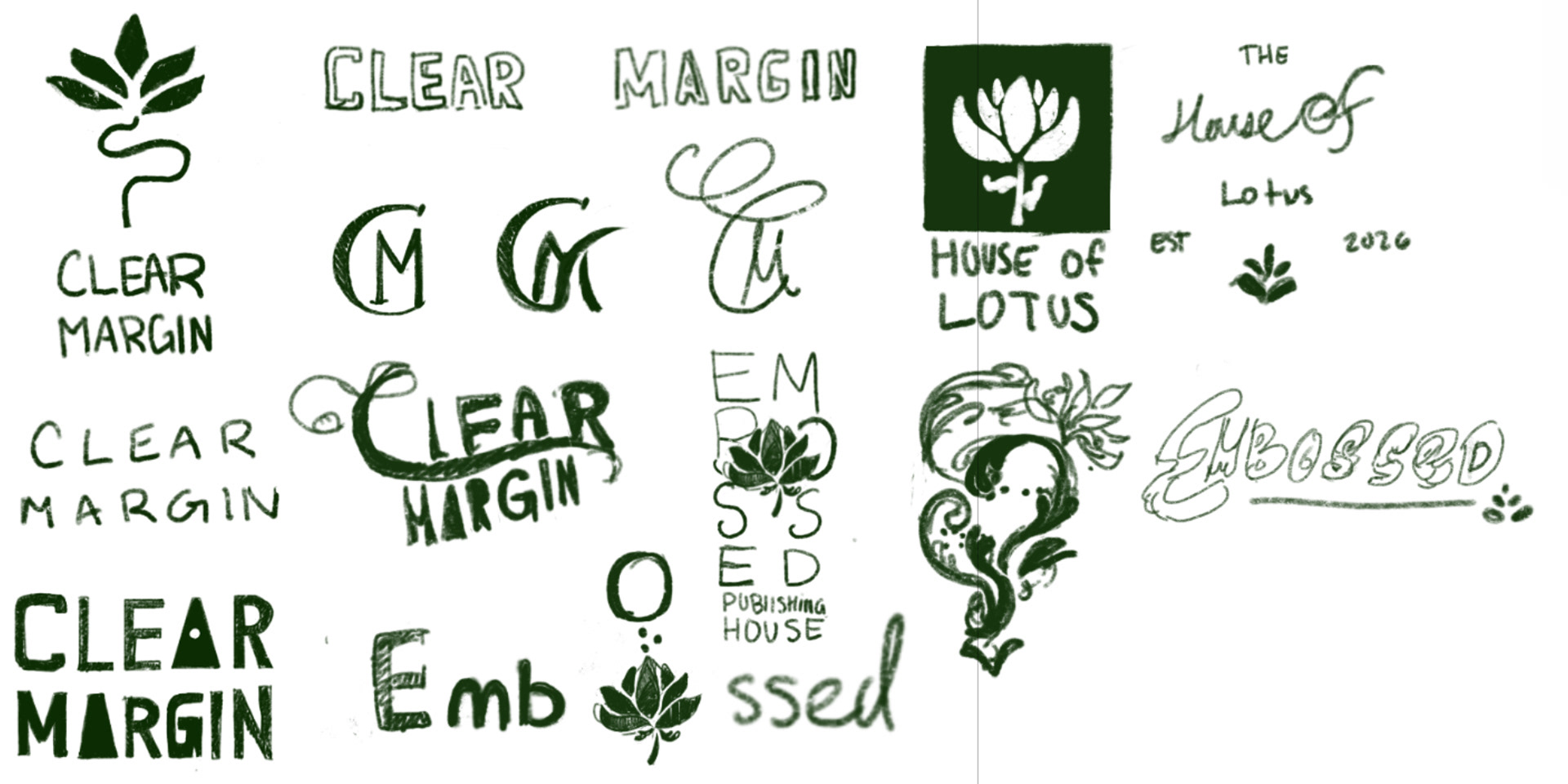
process
Clear margin required a lot of research. The brand positions itself as a bridge between traditional publishing and accessibility, with a focus on legibility and practicality, and avoids overly sterile design. Throughout my research, I found that those with dyslexia find sans-serif fonts easier to read in body copy. I also researched and utilized fonts such as Atkinson Hyperlegible Next.
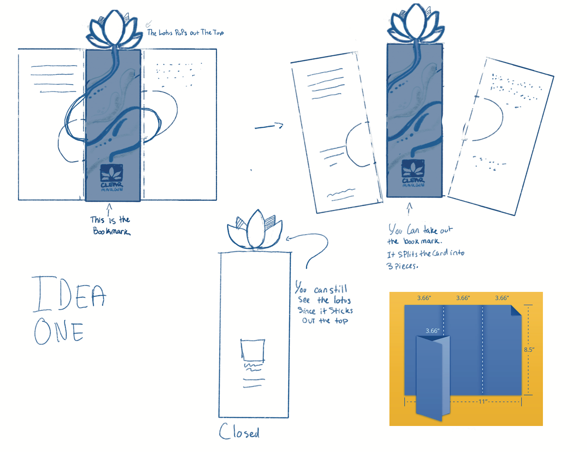
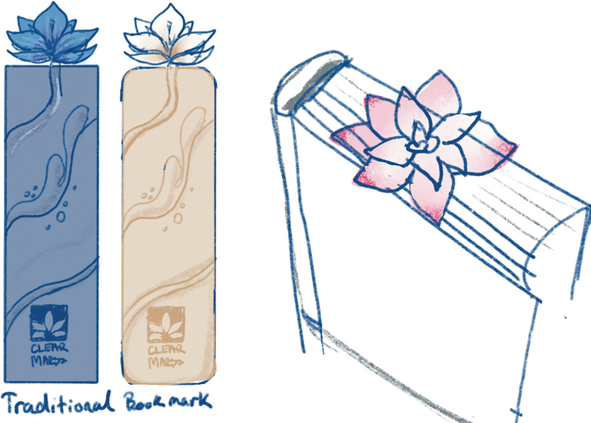
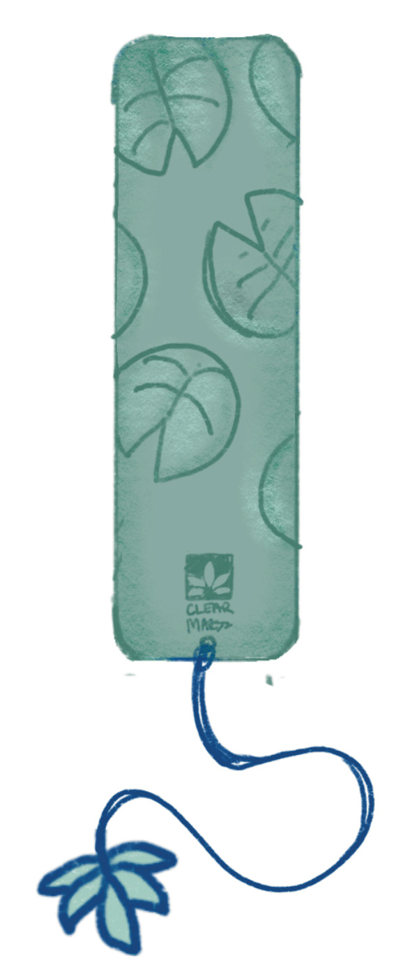
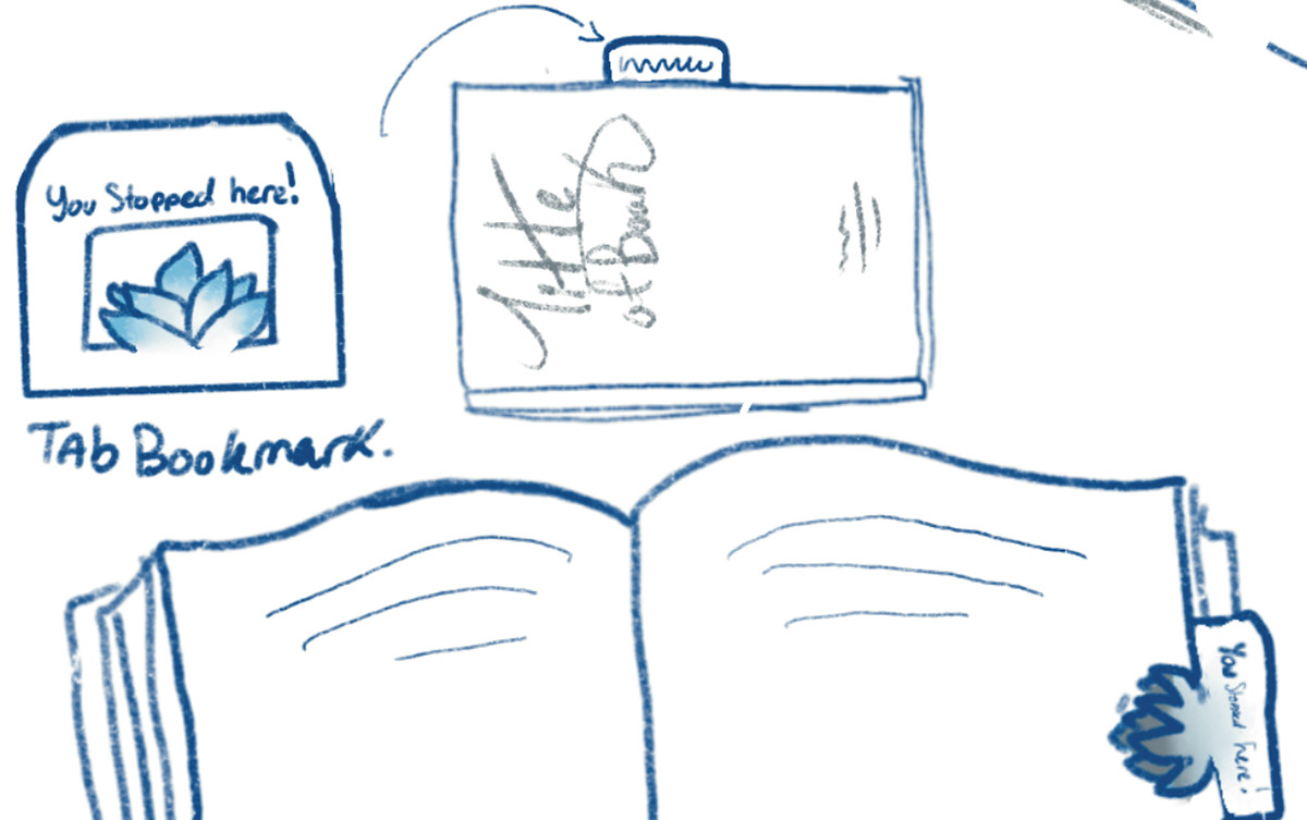
I wanted the bookmarks to have a tactile quality, one that served not only to be aesthetically pleasing for those with vision but as an indicator for those without, where they left off in their book.